ExpressionMatrix2 case study 1
In this case study I illustrate the functionality of
ExpressionMatrix2 software
on expression data from
Darmanis et al., 2017, "Single-Cell RNA-Seq Analysis of Infiltrating Neoplastic Cells at the Migrating Front of Human Glioblastoma", Cell Reports 21, 1399-1410, October 31, 2017.
Special thanks to the paper's authors for providing early access to their data.
This is a small data set with under 4,000 cells.
The ExpressionMatrix2 software is designed to comfortably run
on much larger numbers of cells (it was actually run on a data set with over 1 million cells without any downsampling),
so the compute time required to run the case study is minimal,
and all phases of the run can be performed interactively.
This page contains detailed information sufficient to run the ExpressionMatrix2 software on
these data. It contains the following sections:
Getting started
Setting up the run
Downloading input files
The input phase of the case study
Finding pairs of similar cells
A first look at the data
Limiting the gene set used to compute cell similarity
Clustering
Conclusion
Running this case study can serve as a useful introduction
to performing a run on your own data.
Getting started
To begin, use these directions to make sure you have access
to the software and an environment in which it can run.
When this step is completed, your environment variable PYTHONPATH
will be set to a directory containing a working version of ExpressionMatrix2.so
appropriate to your platform.
To run this case study you will need to use ExpressionMatrix2 release 0.3.0 or later.
Setting up the run
Make a copy of directory tests/CaseStudy1 from the
ExpressionMatrix2 release you are using.
To avoid possible errors or problems due to
incompatibilities between releases,
make sure to use the same release from which
your ExpressionMatrix2.so originates.
In the rest of this page, I will call this copy the
CaseStudy1 directory, and assume that all commands are
run from here.
At this point, your CaseStudy1 directory
only contains some Python scripts and a README file.
Downloading input files
The run requires the following input files, which can be downloaded from here:
GBM_raw_gene_counts.csv
GBM_metadata.csv
When your downloading is complete, move these files to your
CaseStudy1 directory.
These files will be accessed with read-only access.
You may want to protect them by changing their access
permissions accordingly, for example using the following command:
chmod ugo-w *.csv
The expression matrix in file GBM_raw_gene_counts.csv
consists of raw read counts for each gene,
which are integer numbers.
However, the ExpressionMatrix2 software
accepts as input expression counts which are floating point numbers,
for generality. This allows applying, if desired, pre-normalization steps
and/or non-linear transformations of the raw read counts
(for exampe, logarithmic transformations to emphasize the importance
of low expression genes).
You can begin the run using the following command:
./input.py
This causes the ExpressionMatrix2
software to read the input files and create a binary
representation of the expression matrix
in GBM_raw_gene_counts.csv
and of the cell meta data in GBM_metadata.csv.
This will run quickly (under one minute),
and the run time will be dominated by the
time to read and parse input file GBM_raw_gene_counts.csv
containing the expression matrix.
After this, the two input files will no longer be needed.
Instead, all required information is stored in binary files in the
data directory that was created in your
CaseStudy1 directory.
Additional commands to be run later will create
additional binary files in the data
directory that will contain various types of
data structures used by the ExpressionMatrix2 software.
These binary files provide fast sequential or random access to
the required data structures and are quite compact.
At this point the size of the data directory
is about half the size of the input csv files, and
is dominated by the space necessary to store the expression
matrix in a compact, sparse format
(file data/CellExpressionCounts.data).
Note that, if for any reason you want to restart the run,
you need to remove the data
directory manally before running input.py again.
This is a safety feature to prevent inadvertent
data loss.
The scripts in the CaseStudy1 directory
assume you are using a platform that uses Python 3.
If you use Python 2, you need to use the following instead of the
above command:
python input.py
This also applies to all invocations of Python scripts
for the rest of the case study.
See here for details of input.py.
Finding pairs of similar cells
With the expression data and cell meta data now stored
in the binary formats required by the ExpressionMatrix2
software,, the next step is to find pairs of cells that have similar
gene expressions, with similarities computed taking all genes
into account. This is done using command
./compute1.py
The computation is fast (only a few seconds) as it is done
using Locality Sensitive Hashing (LSH).
See here for details of compute1.py.
A first look at the data
At this point we are ready to take a first look at the data
using the http server functionality of the ExpressionMatrix2
software.
Starting the http server
To do this, we use script runServer.py
to start the ExpressionMatrix2 in
http server mode:
./runServer.py
The code in runServer.py is very simple. It simply
creates the ExpressionMatrix object just like the
compute1.py script did, then invokes function
explore
to start the http server.
When the server starts, it writes a message containing the port number
on which it is listening for connections - usually port 17100.
The server will continue to run until you interrupt it using Ctrl-C
or by killing the process. However, most of the time
it will be doing nothing - it will just be waiting
for http requests from browsers.
Connecting a browser to the server
With the server running, we can use a browser to explore the data.
The browser communicates with the server using the http protocol,
and can run on the same machine as the server, or on a different machine,
as long as the two machines can communicate over a network or
via the Internet.
In the simplest mode of operations, the browser runs on the same machine
as the server. Start the browser and point it to this URL:
http://localhost:17100
(Make sure to change the port number from 17100 to whatever
port number the server is listening on, which you found
out when starting the server).
If the browser is running on a different machine,
enter the same URL but replace localhost
with the name or ip address of the machine
where the server is running.
For example, the URL could look like this:
http://server.company.com:17100
or
http://192.51.100.57:17100
For this to work, however, it may be necessary to change the configuration
of firewall software or firmware on the server or on one of the routers
in between by "opening" TCP port 17100, and preferrably the range
17100-17110 to allow some flexibility, as the server
will try higher numbered ports if port 17100 is not available.
Security warning: depending on your network and firewall configuration,
it may be possible for anybody with network access to the server
to look at your data and manipulate them.
Use appropriate security precautions to prevent
unwanted access to the data.
Your IT department will be able to provide security advice.
The ExpressionMatrix2 software was developed
mainly using the Firefox and Chrome browsers.
However most browsers will work, including browsers available
on cell phones and other mobile devices.
Exploring the data in the browser
When you connect your browser to the server,
the browser window will look like this:
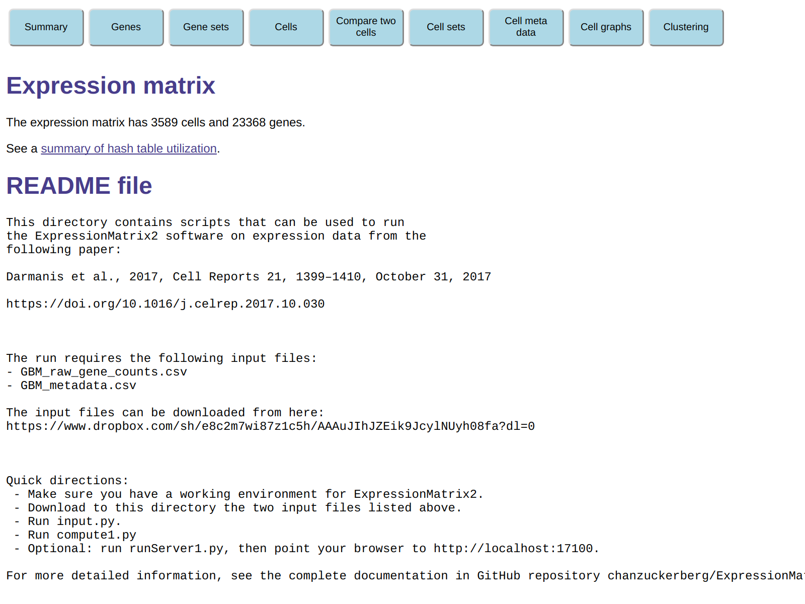
The page summarizes the number of cells genes in the expression matrix
we are looking at, and then displays the README file in the
CaseStudy directory. At the top of the page are
several buttons that can be clicked to explore the data set in a variety of ways.
For example, you can display information about genes, cells and cell meta data.
You can also create and manipulate gene sets and cell sets, which are
subsets of the genes and cells in yiour expression matrix.
Initially only the AllGenes and AllCells sets exists,
but you are free to create additional sets in a variety of ways.
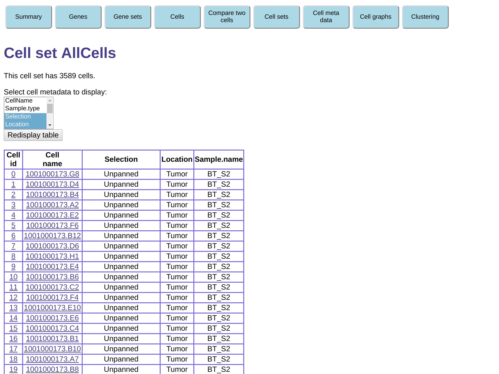
As an example of using this functionality to explore the data, click on
Cell Sets and then, in the table of cell sets, click
on the hyperlink for cell set AllCells.
This will display a table of all the cells in this cell set
(which of course includes all 3589 cells in our expression matrix),
and also gives you the ability to select meta data fields to be displayed.
For example, in the field Select cell metadata to display:,
select Selection, Location, and Sample.name
(in most browsers
you will need to press the Ctrl key while selecting the second and third fields).
Then click on Redisplay table to obtain a table of
cells including the meta data fields you selected:
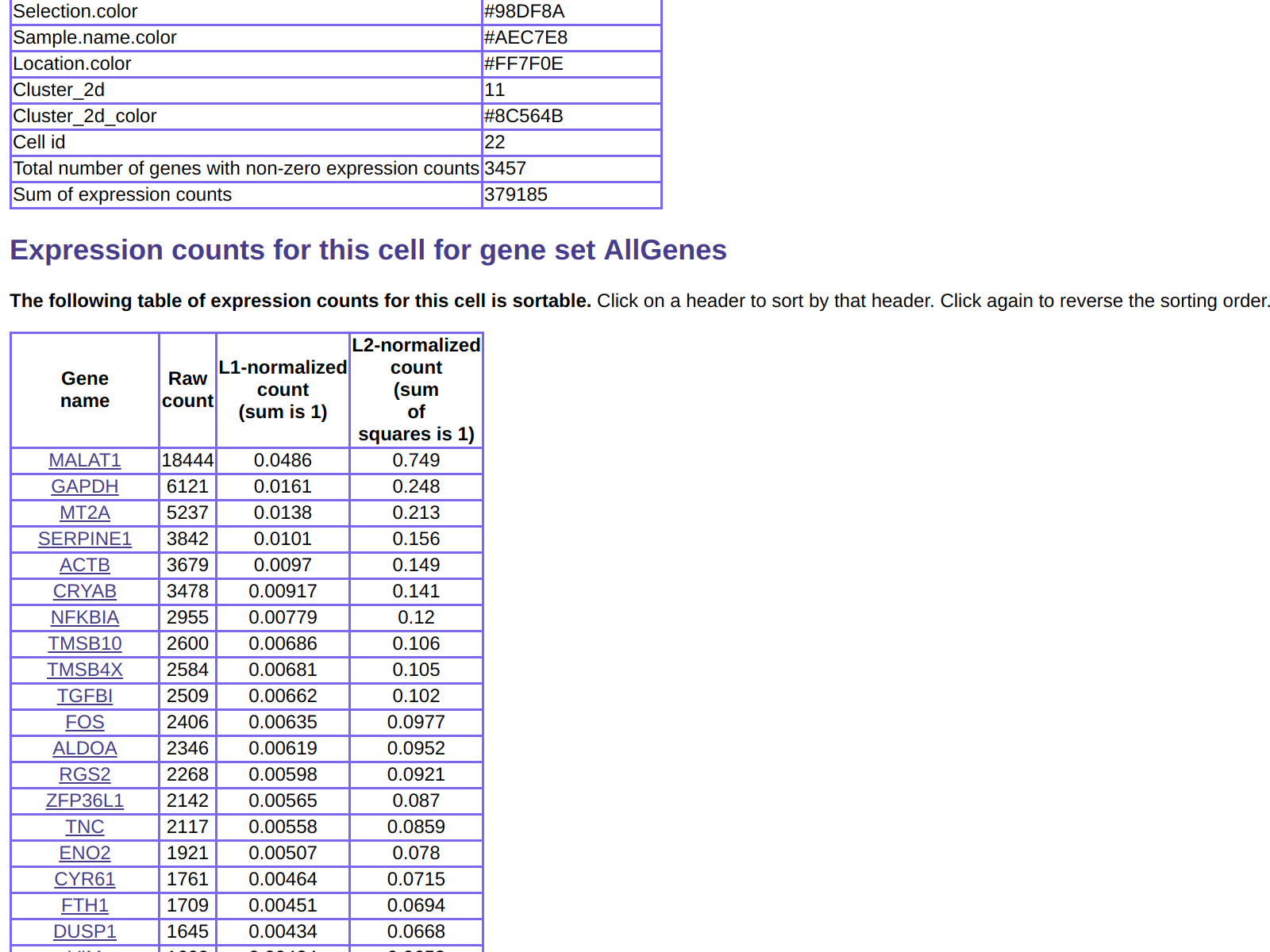
You can then click on any cell to get detailed information about it:
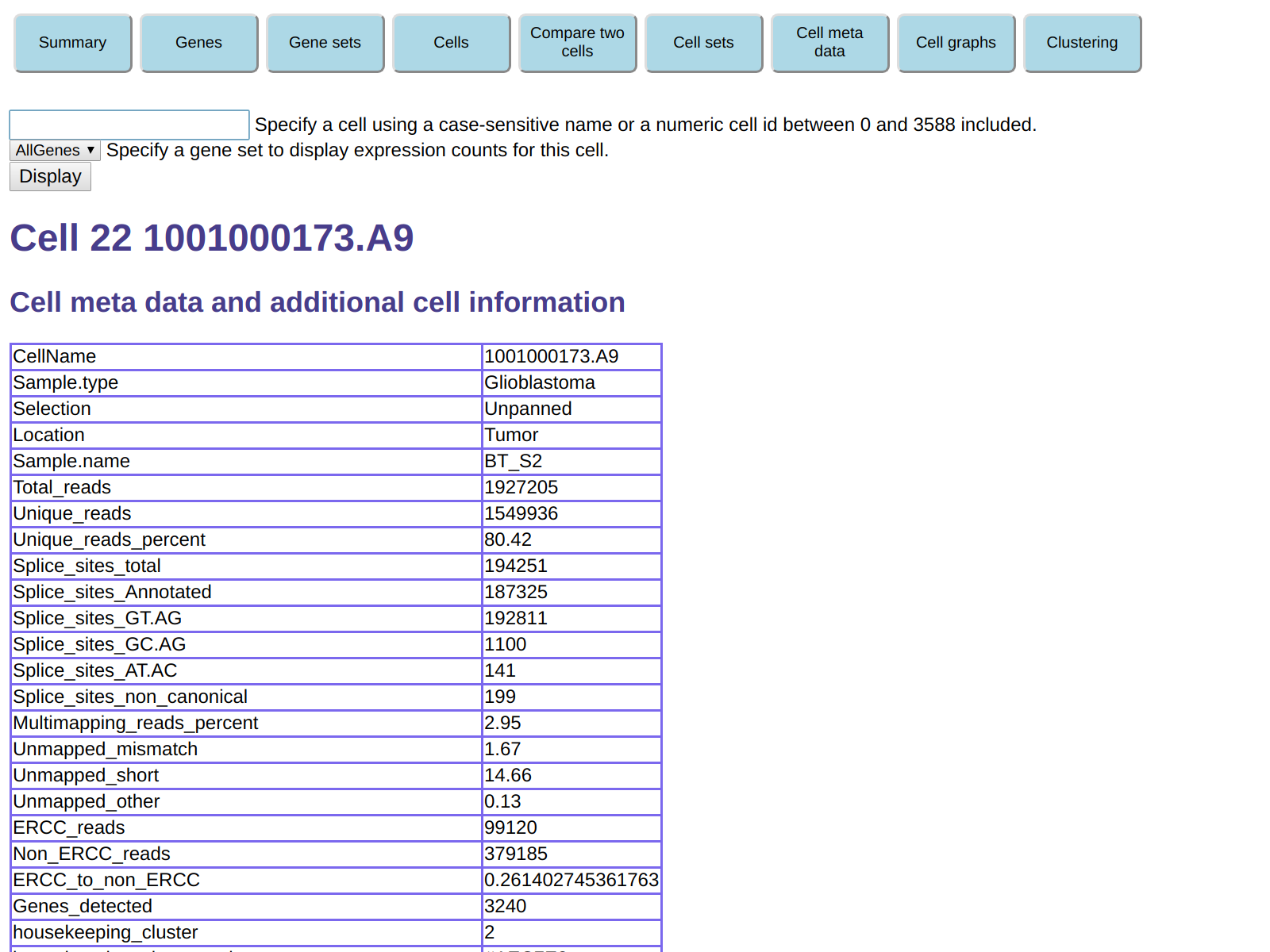
This also includes gene expression for the cell, which can be seen
by scrolling down:
As another example of using the http server functionality to explore the data,
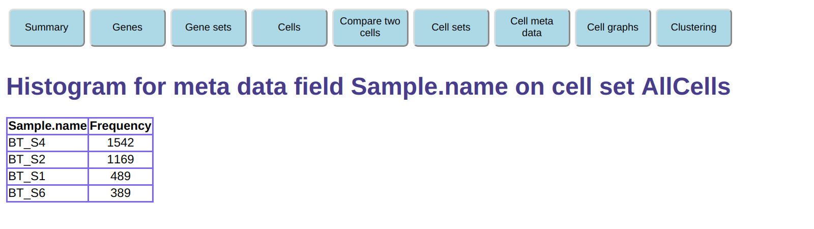
click on the Cell meta data button on the top, then
under Histogram a meta data field select the AllCells
cell set and select meta data name Sample.name,
then click on Create histogram.
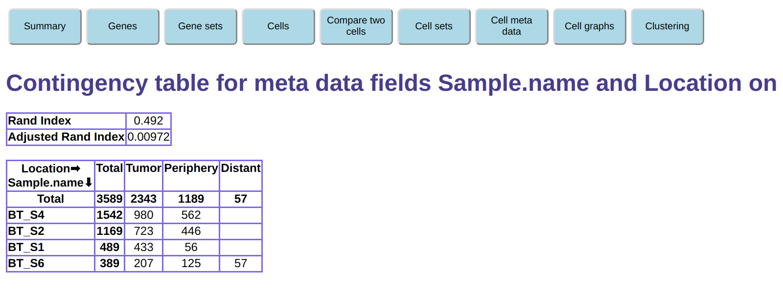
We can also create a contingency table showing the
combined frequency of two meta data fields.
Click the Cell meta data button on the top, then
under Contingency table for two meta data fields select the AllCells
cell set and select meta data names Sample.name and Location,
then click on Create contingency table.
You can familiarize yourself with the rest of the functionality
to explore the data. Most of it should be self-explanatory.
We computed above pairs of similar cells
using script compute1.py.
We can now use these pairs of similar cells to create a
cell similarity graph - an undirected graph in which
each vertex represents a cell, and two vertices
are joined by an edge if the corresponding edges have
similarity greater than a chosen similarity threshold.
To avoid regions in the graph with very high connectivity,
we use a k
parameter that causes only the
best k neighbors to be kept for each vertex (k-Nearest
Neighbor or k-NN graph).
To create such a cell similarity graph (or simply cell graph)
you can click on button Cell graphs at the top of the browser window.
Then, you can select graph creation parameters:
Cell graph name: for this graph we will use all of our 3589 cells,
and our similar cell pairs were computed taking all genes into account.
Therefore, we will choose All as the graph name.
Cell set name:
we pick the only choice available, AllCells, as we have not yet
created any additional cell sets.
Similar pairs name:
we pick the only choice available, Lsh, which is the only
set of similar cell pairs we created. As a reminder,
when doing that we took into account all genes
when computing cell similarities.
Similarity threshold:
we will keep the default value of 0.5. Only cell pairs with similarity at least
0.5 will generate a graph edge. The similar cell pairs were computed
using a threshold of 0.2 (the default value for
similarPairs3), so we will not lose
any edges due to insufficient information being stored in our similar cell pairs.
Maximum connectivity:
this is the k for the k-NN graph.
We will keep the default value of 20.
The similar cell pairs were computed using k=100
(the default value for
similarPairs3), so we will not lose
any edges due to insufficient information being stored in our similar cell pairs.
You can now click on Create a new cell graph.
This shows a page with a message stating the the graph had 84 isolated vertices, which were removed.
This means that there were 84 cells that no other cell with similarity at least 0.5.
These cells will not be present in the cell similarity graph.
Clicking on Continue gets you back to the Cell graphs
page, which now shows the cell graph you just created, named All.
You can display the graph by clicking on its name.
After a short wait to compute the graph layout using the Graphviz package,
the graph is displayed:
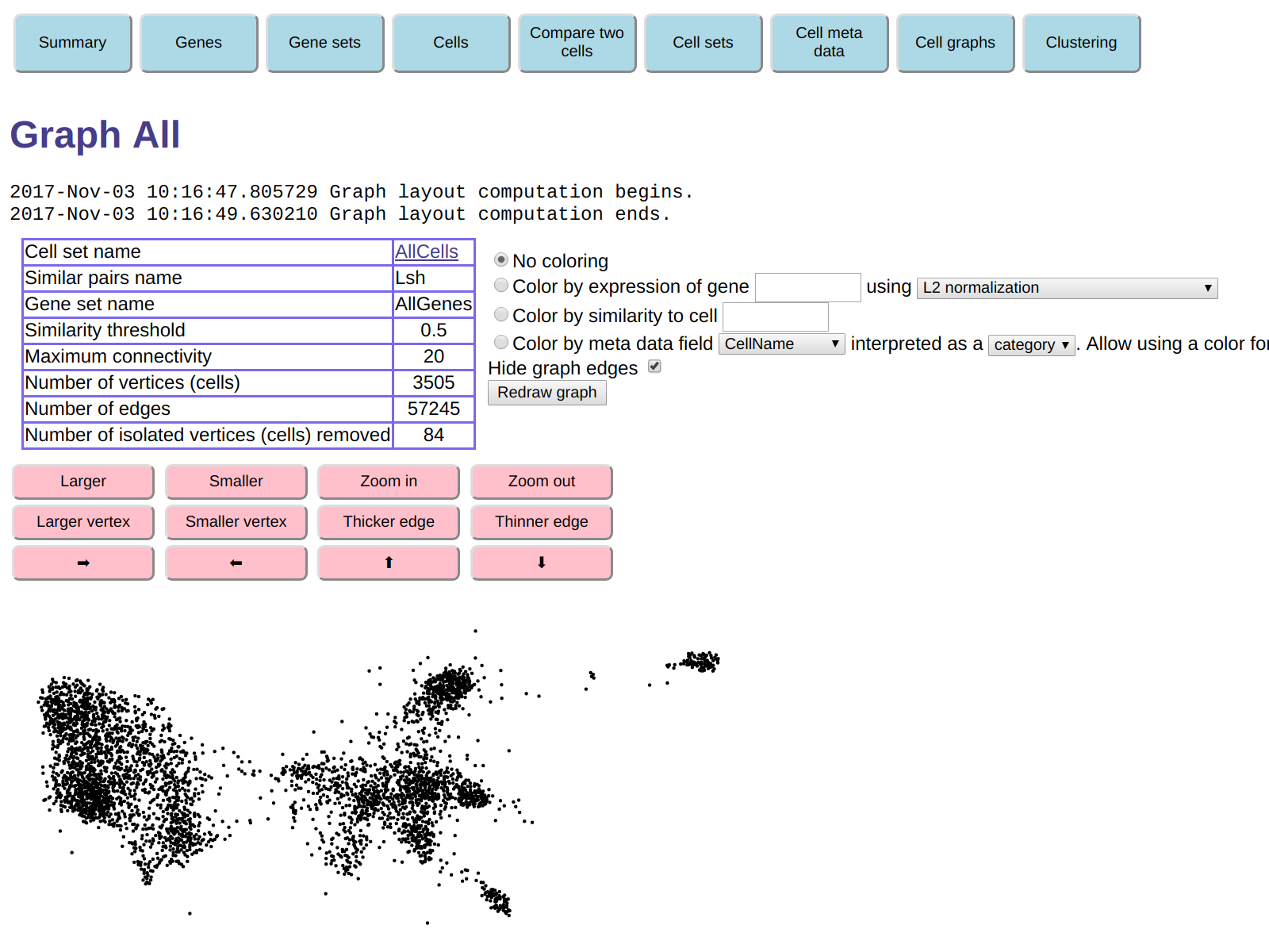
The graph is displayed without edges for clarity and performance, but you
can turn the edges on, if desired, by unchecking the Hide graph edges
option and clicking on Redraw graph.
Note that the Graphviz package is used exclusively to compute the two-dimensional
layout of graphs for display. This layout is not used for any other
purpose, including clustering (more information on clustering follows).
It is just a visual aid.
You can experiment using the pink buttons to make the graphics larger, zoom in or out
to visualize specific regions of the graph, and
change the display size of vertices and the thickness of edges.
You can also color the graph in a variety of ways that should be self-explanatory.
This includes coloring by expression of a specific gene,
coloring by similarity to a specific cell, or coloring by
categorical or numerical meta data.
You can also click on a vertex to display the page for the corresponding cell.
This complements the coloring options to allow you to get
an idea of the characteristics of cells present
in different regions of the graph.
The graph shows clumps that correspond to groups of cells with similar expression vectors.
In an overly simplified view of cell populations, each of these groups corresponds
to a "cell type". The reality, of course, is much more complex.
The ExpressionMatrix2 software provides clustering functionality
which finds these clusters automatically, and I will cover this functionality below.
The Darmanis paper used a commonly used clustering approach,
t-SNE,
to classify the cells in groups, and each cell contains two meta data fields
that describe the clustering computed by t-SNE:
- Meta data field
Cluster_2d
contains the id of the cluster each cell was assigned to.
- Meta data field
Cluster_2d_color contains the color assigned to
the cluster each cell was assigned to.
These colors are the same colors used in Figure 2(A) of the Darmanis paper.
The colors are stored as strings in HTML
hex triplet
format, that, is in the form #RRGGBB, where RR, GG, BB are hexadecimal bytes
representing the red, green, and blue intensities.
To see where the t-SNE clusters are located in our cell similarity graph,
we can redisplay the graph, coloring each cell in the color given by its
Cluster_2d_color.
To do this, in the form above the graph display check the Color by meta data field button,
and in the selections to the right of that button
select meta data field Cluster_2d_color
and ask that the field be interpreted as a color.
The graph display will no look like this:
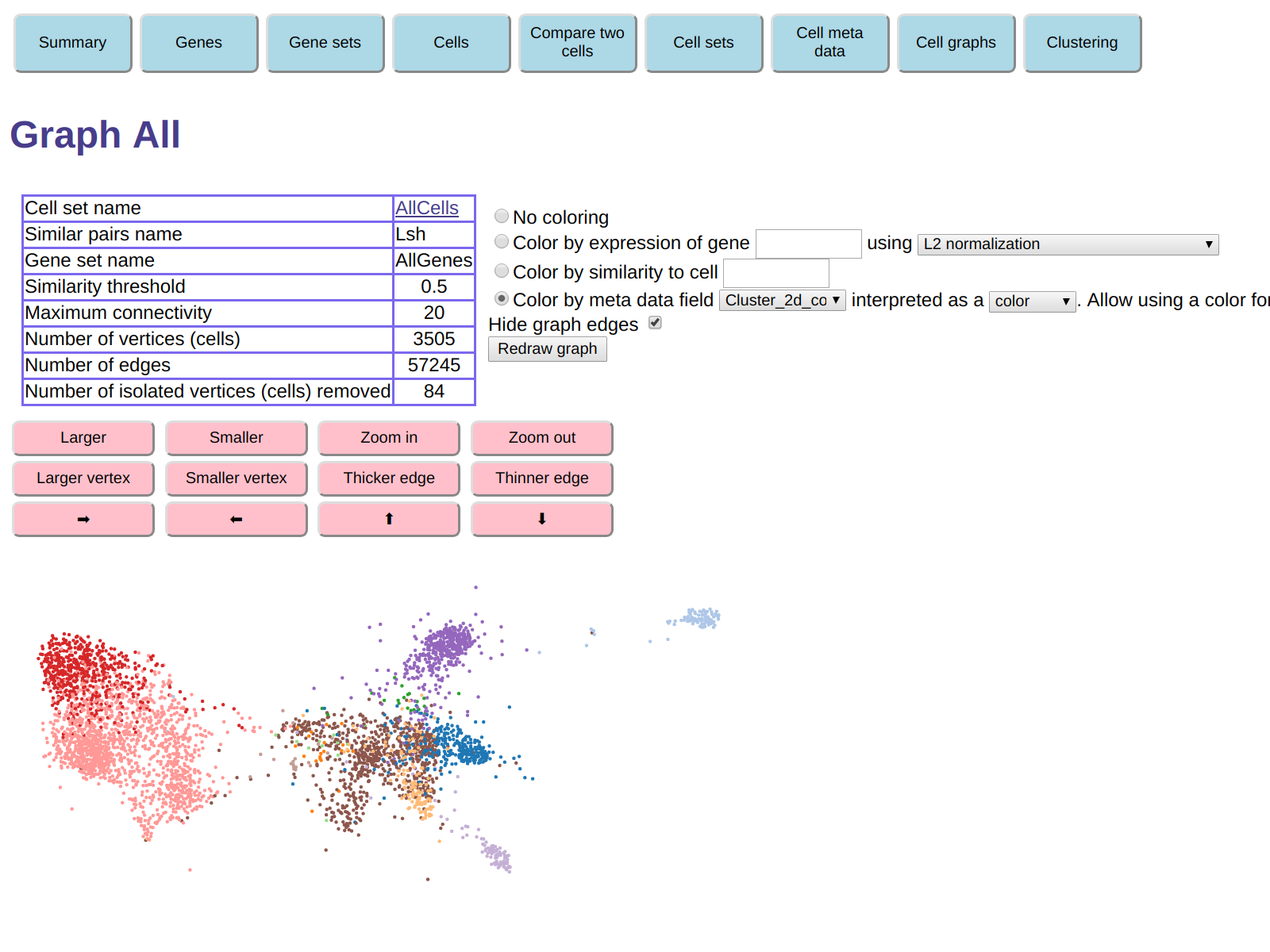
We see that the clumps in the graph display correspond roughly to the t-SNE clusters.
Limiting the gene set used to compute cell similarity
The ExpressionMatrix2 graph was constructed
taking into account expression counts for all genes,
which means that the similarity of two cells is defined
as the regression coefficient between the expression counts
of the two cells, taking all genes into account.
In contrast, the Darmanis paper
used only 500 genes selected based on the variability of their
expression.
In the ExpressionMatrix2 software,
we can use gene sets to restrict the set of genes used.
Clicking on the Gene sets button at the top of the browser page
leads to a page that offers a variety of ways to create a new gene set,
including by pasting a set of gene names.
This option could be used to define a gene set identical to the one
of 500 genes used in the Darmanis paper.
Another option is to use the dialog near the bottom of the page,
Create a gene set using gene information content.
This creates a gene set based on an information content criterion
(e. g. a gene that is equally expressed in all cells has zero information content,
a gene expressed only in one of N cells has information content log2N bits).
We can select AllGenes as the starting gene set,
AllCells as the cell set used to compute information content,
request an information content of at least two bits,
and name the resulting gene set HighInformationGenes.
The same operation could also be performed in Python code
using function
createGeneSetUsingInformationContent.
The resulting gene set has 22442 genes out of the 23368 total.
You can use the Gene sets page to look at the new gene set in detail.
To see what genes were removed, you could create a new gene set
consisting of the set difference betwene gene sets AllGenes
and HighInformationGenes.
You can also show the computed information content of each gene by using the dialog under
Show gene information content
near the bottom of the Gene sets page.
Now that we have a new gene set, we can redo the computation of the
pairs of similar cells, this time taking into account only the
gene set we just created.
This is done by compute2.py, which is very similar to
compute1.py, except that it requests using the gene set we just created.
To run it, make sure ot first interrupt the http server (using Ctrl+C),
then run command
./compute2.py
Like compute1.py, this takes just a few seconds for this small data set,
after which you can restart the http server:
./runServer.py
In the browser, click on the Cell graphs button.
You will notice that cell graph All we previously created
disappeared. This happens because graphs (contrary to gene sets
and cell sets) are currently not persistent.
In addition to recreating it, you can also create a new graph,
which you can name
AllHighInfo,
which still uses cell set AllCells,
but now uses the similar cell pairs LshHighInfo
just computed by compute2.py.
With coloring by t-SNE color as before and displayed with edges hidden, the graph looks like this:
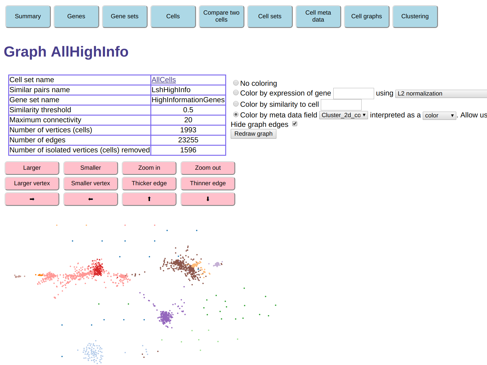
The clumps are generally more separated. However the table shows that 1596
vertices (cells) were isolated and were removed. This means that for each
of the 1596 removed cells there was no other cell with similarity
greater than 0.5, the default similarity threshold used to construct the graph.
This means that almost half of the cells were removed.
This is not surprising, because we discarded genes that were expressed in many cells,
and were therefore generally increasing the similarity between cells.
To obtain a more informative graph,
we can create a new graph
in the same way, but choosing a similarity threshold of 0.2 instead of 0.5.
Call this new graph AllHighInfo2.
Now the number of isolated cells that were removed decreases to 22.
With coloring by t-SNE color as before, the new graph looks like this:
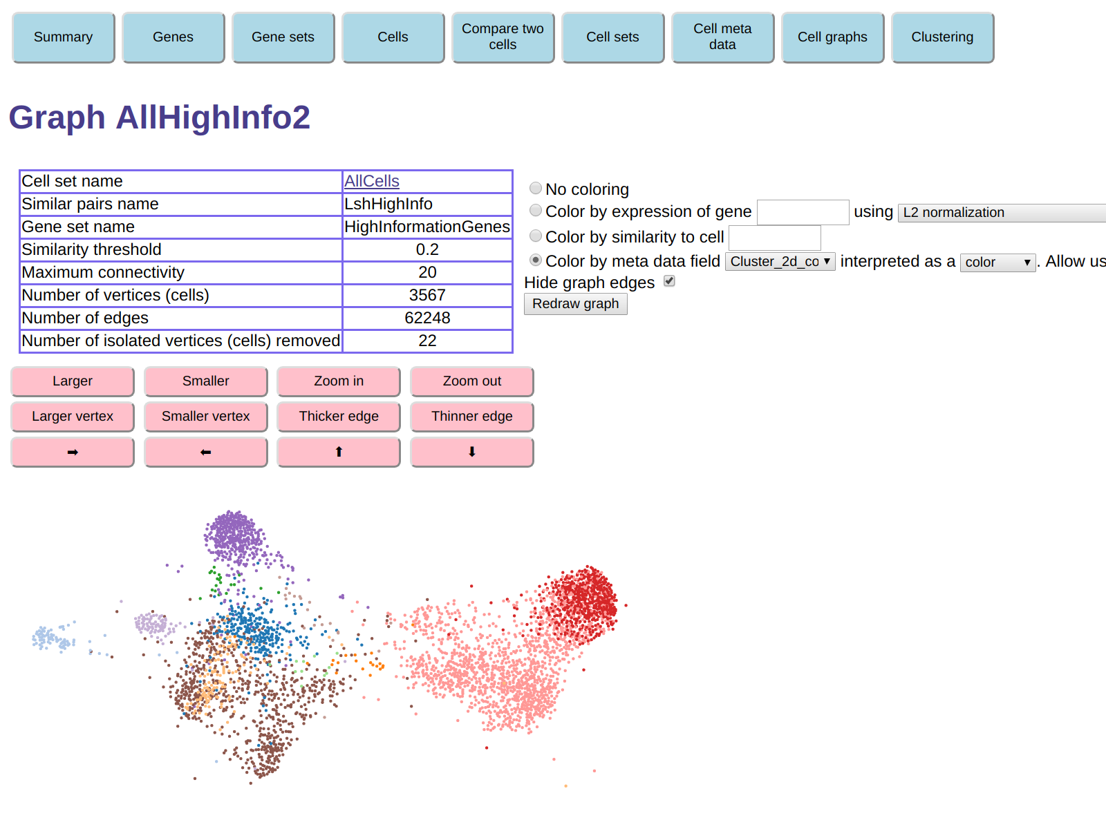
Clearly, it can be useful to experiment with the graph creation parameters.
Different choices can reveal different aspects of the data set.
The http server offers various means to investigate the details of this graph - for example,
what type of cells are present in each of the clumps.
To do this, you can use one or more of the following:
- Click on a vertex of the graph to get to the page describing the corresponding cell.
From that, find the most expressed genes in that cell
(in gene set
HighInformationGenes), then redisplay the graph, coloring
by expression of those genes.
- Hover the mouse on a vertex of the graph to get the cell id (a number)
of the corresponding cell. Then color the graph by similarity to that cell.
- Color the graph using one of the meta data fields.
For this data set, coloring by meta data fields
Selection,
Location, and
Sample.name,
is particularly informative.
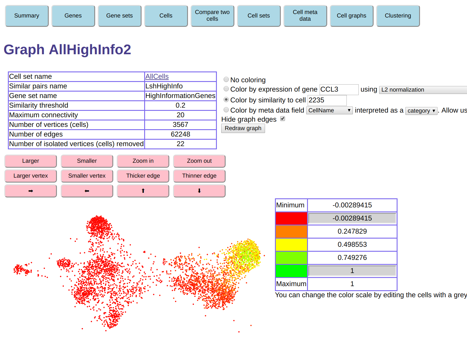
For example, hovering the mouse in the red region on the right
of the display shows that one of the cells there is cell 2235.
Clicking on it shows the page for cell 2235, which reveals that the
most expressed gene is CCL3.
Here is the display we get if we color the graph by similarity to cell 2235:
And here is graph colored by expression of gene CCL3:
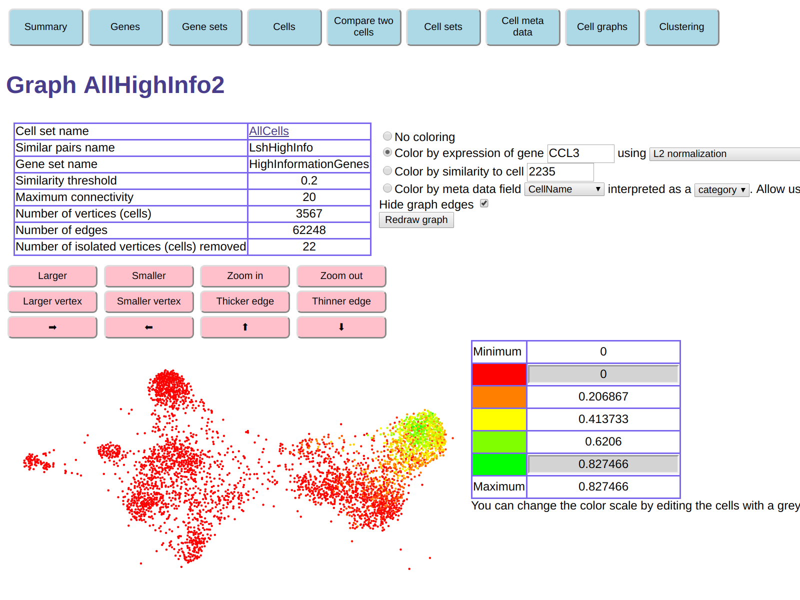
This functionality can be used to explore gene expressions in the various "clumps"
visible in the graph.
Clustering
The ExpressionMatrix2 software also provides clustering functionality
which can be used to automatically find clumps or clusters in a cell similarity graph.
It uses the
Label Propagation Algorithm to assign vertices to clusters.
Additional clustering algorithms may also be added in the future.
After clusters are computed, ExpressionMatrix2 also computes
similarities between the average expression vectors of each cluster,
and creates a Cluster Graph in which each vertex represents a cluster,
and two vertices are joined by an undirected edge if the similarity
between then average expression vectors of the corresponding clusters exceeds a
given threshold.
To compute the clustering, click on the Clustering
button near the top of the browser window,
then click on "Run clustering and create a new cluster graph".
A table appears, requesting various parameters for the clustering computation.
Here, specify AllHighInfo2 as the cell graph.
Leave all parameters at their default values except for setting
the minimum number of cells for each cluster to 50
and the similarity threshold for graph edges to 0.2
(the same value we used when creating the cell similarity graph).
Use the same name AllHighInfo2
as the name of the cluster graph to be created (cell graphs and cluster graphs
use different name spaces, so it's ok to use the same name).
Finally, click on Run clustering.
A page showing log output for the clustering appears.
Here, click on Continue to get back to ther Cluster graphs
page. This page will now contain a link to the newly created cluster graph
AllHighInfo2.
Click on that link to get a display of the cluster graph:
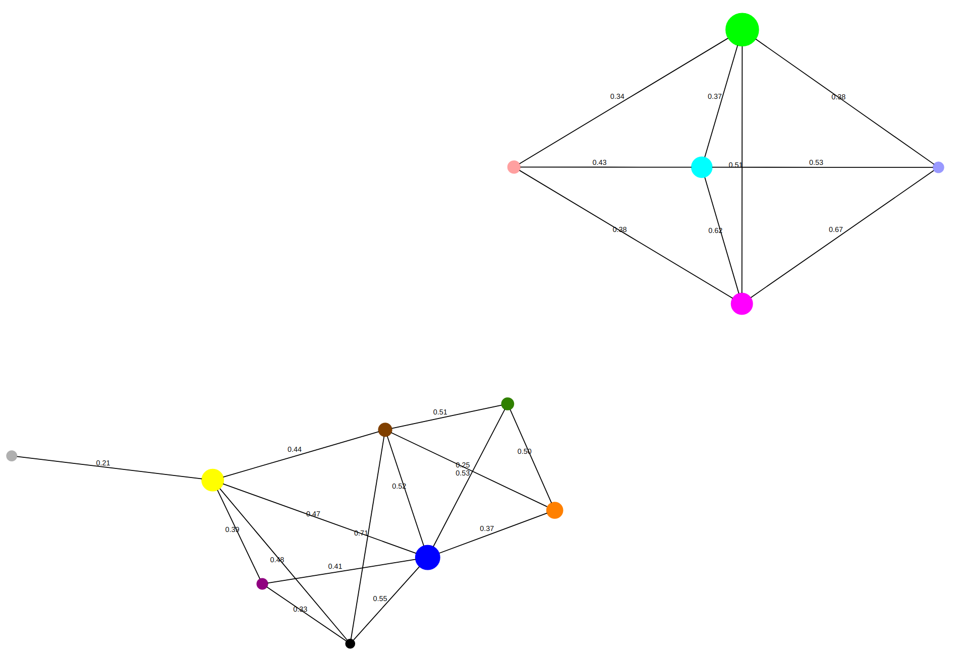
Here, each circle corresponds to a cluster. You can hover on the circle
to find out how many cells are in each cluster, and also to see the most
expressed genes in each cluster.
You can also get more detailed information on a cluster,
including the average gene expression in the cluster and the list of cells that belong to it,
by clicking on it.
Each edge in the display is labeled by the similarity between
the average gene expressions of the two clusters it joins.
You can also compare the gene expression of two clusters or sets of clusters.
To do this, in the page that displays the cluster graph, click on
Compare gene expression between clusters.
In the dialog that appears, specify a "first set" consisting of cluster 0
(the cluster displayed in green) and a "second set" consisting of cluster 3
(the cluster displayed in magenta/fuchsia color).
According to the display of the cluster graph, the similarity
of the average expressions of these two clusters is 0.51.
Then click on Compare.
You get the following display - a scatter plot of the average expression counts
in the second sets versus those in the first set.
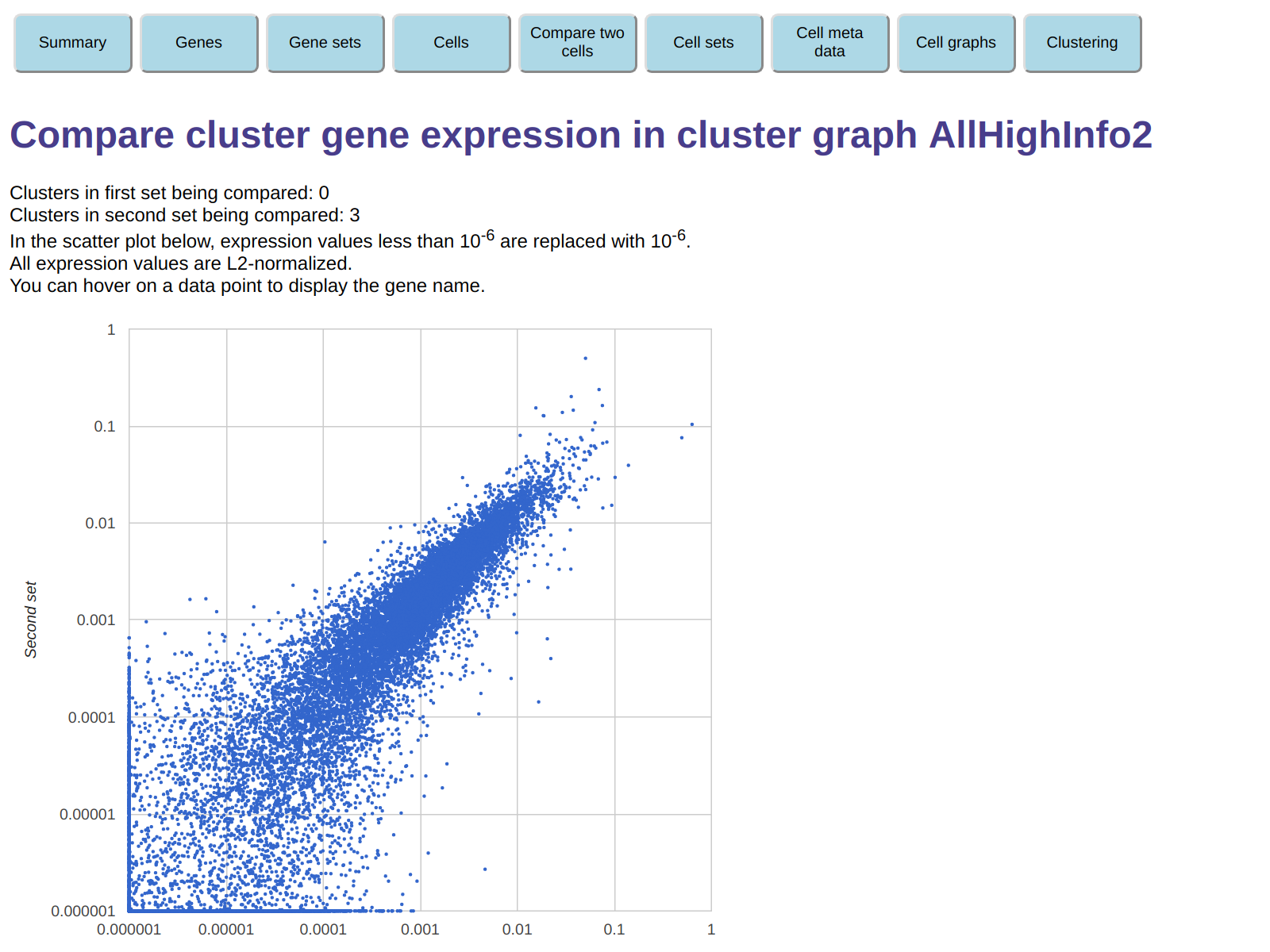
Here, each point corresponds to a gene, and you can hover on a point to get the gene name.
This allows you to easily locate genes tha are over-expressed or under-expressed
in one of the two clusters relative to the other.
For example, the rightmost point in the display corresponds to gene CCL3,
and from its position we can see that this gene is roughly 5 times more
expressed in the first set (cluster 0) then in the second set (cluster 3).
You can do the same
comparison for arbitrary sets of clusters, not just individual clusters.
To see how the cluster correspond to clumps in the cell graph,
we can store the result of the clustering operation in a new cell meta data field.
To do this, click on the button labeled Store the cluster ids in this cluster graph
in cell meta data name after specifying Cluster as the name
of the cell meta data to be used.
Now go back to the display of cell graph AllHighInfo2,
and color it using the meta data field we just created, Cluster,
interpreted as a category.
The display of the cell graph will now look like this:
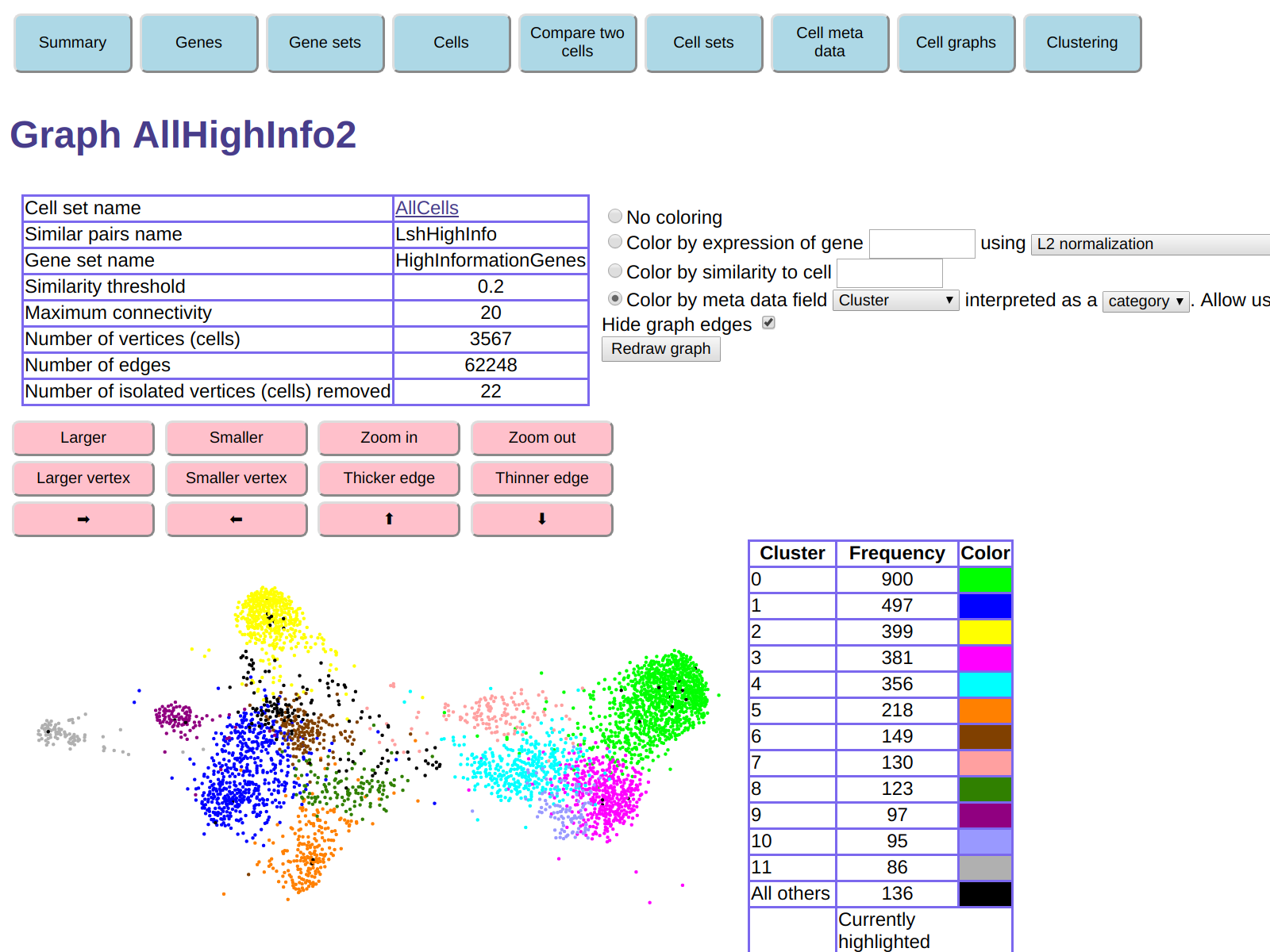
The color in this display correspond to the colors in the display of the cluster
graph, which allows you to locate each of the computed clusters in the cell graph.
You can then see that the general connectivity of the cel graph
is consistent with the graph connectivity of the cluster graph.
For example, we see from the cell graph that the green and bright purple
clusters (clusters 0 and 4) are close to each other,
and in fact the cluster graph shows a similarity 0.51 between those clusters.
You can also see that the the relative placement of clusters in the two graphs
are similar, even though the two-dimensional layouts,
which are used for display purposes only, are not necessarily consistent.
The cluster graph therefore describes in a synthethic way the
clumps in the cell graph and their relative similarities.
Of course, several parameters were used to construct the cell similarity
graph and the cluster graph, and the actual clusters will depend on the choice
of these parameters. This is to be expected, as the type and amount of
desired clustering depends on what questions one wants to answer.
Therefore, changing the creation parameters for the cell and cluster graphs
can be used in the process of exploring and understanding the data.
Despite the above considerations, it is interesting to
compare the results of this clustering with
the clustering obtained via t-SNE in the
Darmanis paper.
To do this, click on the button labeled
oCell meta data, then, under
Contingency table for two meta data fields,
select cell set name AllCells
and meta data names Cluster
(the clustering we just computed)
and cluster_2d
(the t-SNE clustering from the Darmanis paper).
This displays a contingency table of the two clusterings -
that is, a table containing the number of cells
with each combination of the two clusterings.
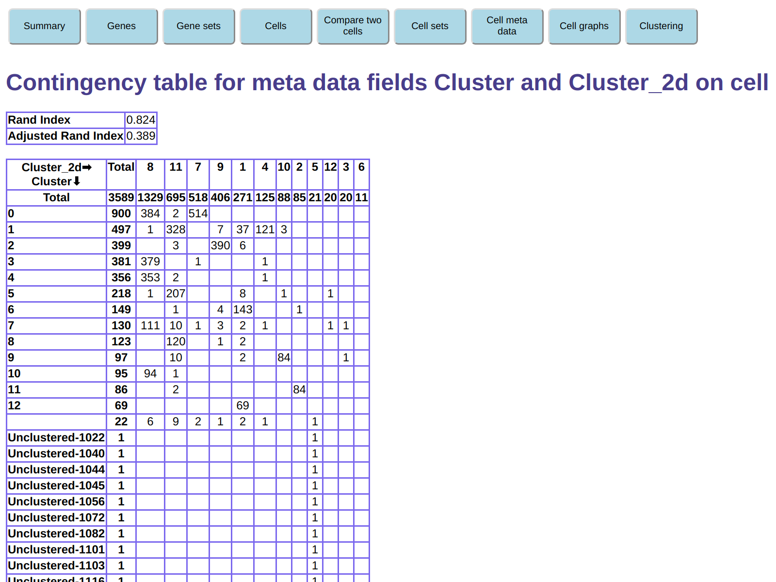
For example, this shows that cluster 0 in our clustering (900 cells) is split into clusters
7 and 8 in the t-SNE clustering.
Conversely, t-SNE cluster 8 (1329 cells) is split between clusters 0, 3, 4, 7, and 10
in our clustering.
We see from our cluster graph display that, for example, the similarity
between the average expressions of clusters 0 and 3 is only 0.51,
so it probably makes sense to keep these are two separate clusters.
For other clusters, there is more agreement between the two clustering.
For example, t-SNE cluster 9 largely corresponds to our cluster 2,
and t-SNE cluster 2 largely corresponds to our cluster 11.
As discussed above, the relative merits of each clustering
can be dependent on the type of information we are trying to extract.
The ExpressionMatrix2 software allows quick exploration
of clustering alternatives, by making it fast and easy to generate
multiple cell similarity graphs and cluster graphs with different
creation parameters.
Conclusion
I used this case study to illustrate most of the functionality of
the ExpressionMatrix2 software currently available, but not all of it.
Most notably, this case study did not illustrate
the functionality to define cell sets - arbitrary subsets of
cells.
Once a cell set is defined, it can be used to create a cell
similarity graph, which will include only cells in the set.
This way you can restrict your investigation to a subset of cells of interest.
This can facilitate data interpretation by reducing distractions
due to cell populations unrelated to the topic of interest.